诗贝姆 is a breast health clinic that starts in Wenzhou China
The original logo took a more outright approach for showing its relation to breast health. Piecing together the different elements gave an amateur look with little cohesiveness.
The redesigned logo keeps the concepts of the brand while giving a more elegant presentation. The new version combines the different elements and uses the more symbolic icon to draw in the target audience.
Rather than the generic font, using the uniquely designed type brings better balance to the logo itself and gives more contrast between the icon and the type.
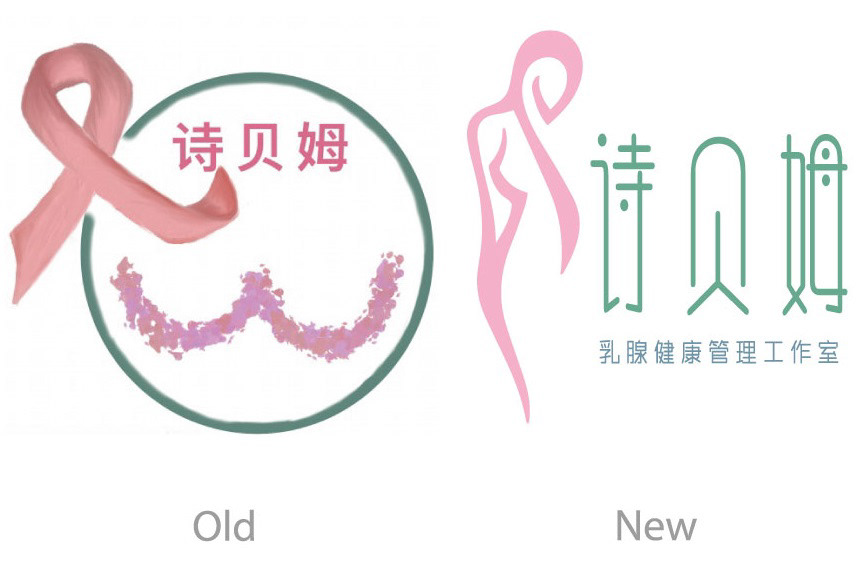
Evolution
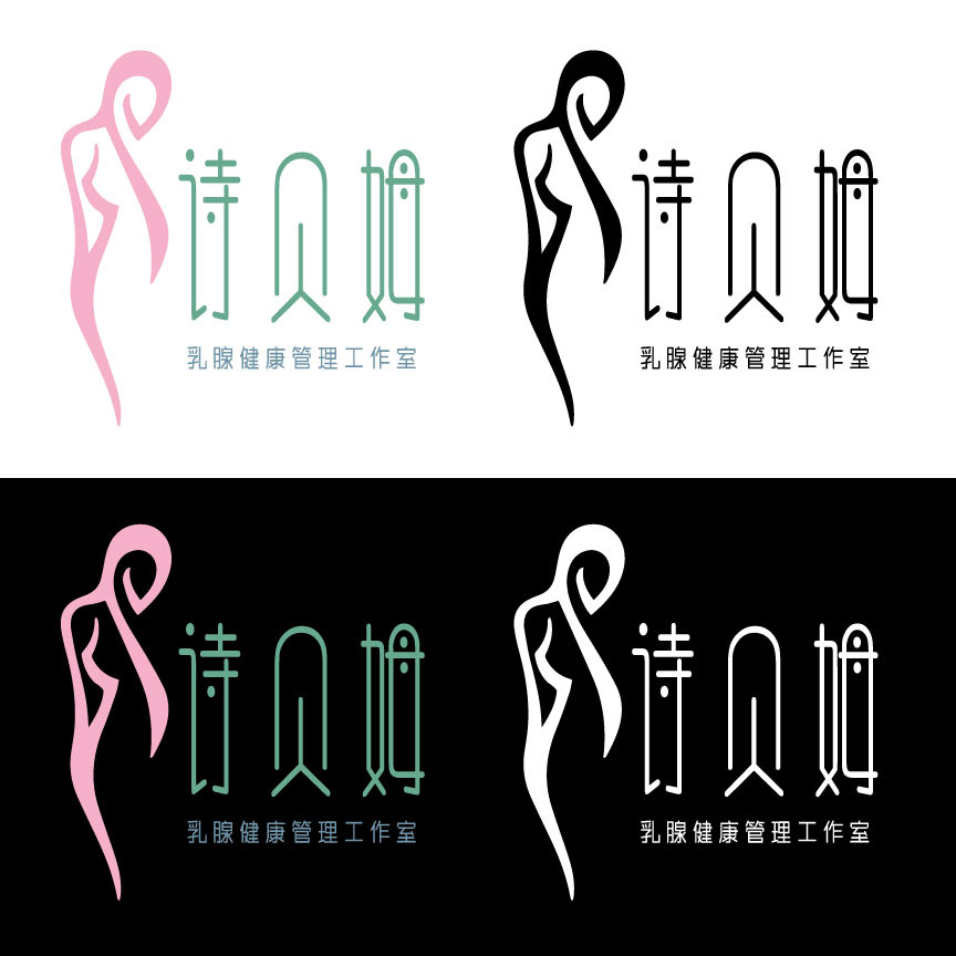
Variety